 |
| Symmetrical Balance - Photo by David Helsham |
 |
| Contrast in Scale - Photo by Michael Kenna |
 |
| Color Contrast - Photo by Olivia Bee |
 |
| Radial Balance - Photo by Rachel Hulin |
 |
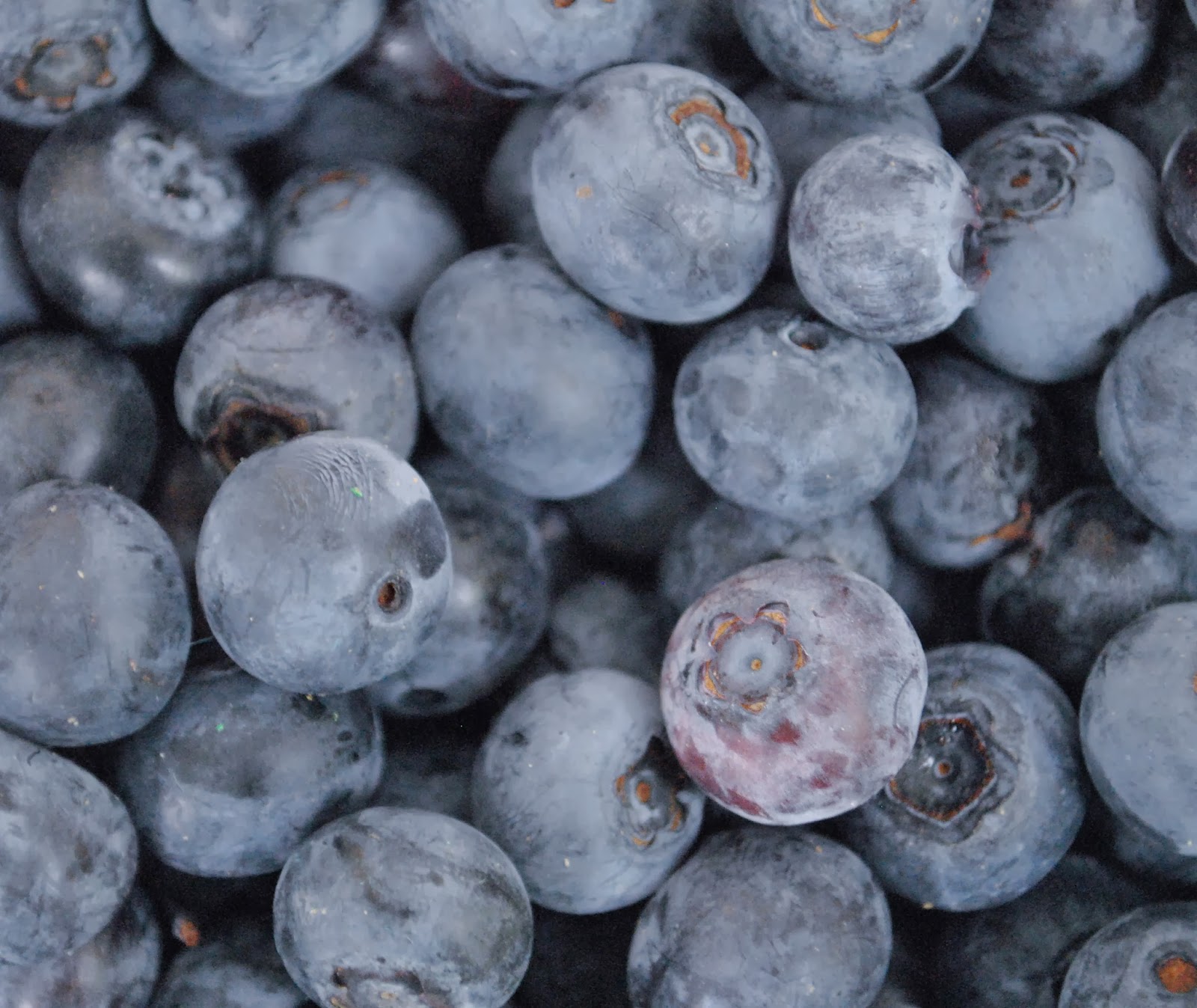
| Contrast in Texture - Photo by Zeb Andrews |
|
| Symmetrical Balance - Photo by David Helsham |
|
| Contrast in Scale - Photo by Michael Kenna |
|
| Color Contrast - Photo by Olivia Bee |
|
| Radial Balance - Photo by Rachel Hulin |
|
| Contrast in Texture - Photo by Zeb Andrews |
 |
| The Finer Things in Life - This is a photo that I took of my friend Sydney in my living room. This is the stand alone photo that I took that used color to set a mood. I believe that the warm colors in this photo, along with the manipulation of the set, created a very inviting and cozy mood. It also created a sense of regality and sophistication. In order to create this photo, I dressed Sydney in all red as well as lit the fire and made the golds and reds in my living room more noticeable. To edit, I enhanced the warm colors as well as put a vignette around the photo to focus on the main subject. |
 |
| Simplicity - The subject in this monochrome grid is my friend, Sydney. For these photos, I dressed my friend in very simple clothing and made her pose in front of a white wall I have in my house. This grid was focused on the simple beauties of my wonderful friend. I created a custom grid to make certain photos more prominent. I also created a preset using a custom black and white preset I made, along with a bluish tinted split tone. This gave the preset a more film like feel. Along with this, I added a little bit of grain. This is my favorite grid from this project. |
 |
| Merry Christmas - This is my complementary colors grid. The photo I used is an abstract crop of a sunflower from the farmer's market. I then increased the contrast and darks and changed the colors of the petals into complementary colors. I thought this photo was really cool and it reminded me of a Christmas reef. |
 |
| Kiss Kiss - This is my grid of choice. I am a big fan of Andy Warhol and I was attempting to emulate something similar to his work. This is a photo of my friend's lips. I then cropped it into a square and changed the colors and tints of the photo. Afterward, I made a 6 x 6 grid and arranged them in an interesting pattern. I really like this photo and think it is very funky. |
 |
| Fire and Ice - The photo in this grid is one I cropped from a larger picture of a sunflower. I thought it would be cool to crop the original picture this way and then try to reconstruct the flower using grids and a kaleidoscope effect. Along with this, I edited the flowers to make them look fiery and icy because it was an interesting color complement. This was an extra grid I did from the ones assigned for the original project. |
 |
| Intertwined - This is a kaleidoscope grid I made out of a picture of leaves and branches. First I enhanced the colors in the photo. I then made one kaleidoscope image by rotating the photo. Then, I put four copies of that kaleidoscope onto a 2 x 2 grid and it created this really cool pattern. |
 |
| Color Wheel with Tertiary Colors |
 |
| Photo By Parker Fitzgerald |
 |
| Filling The Frame |
 |
| Bird's Eye View |
 |
| Frame Within a Frame |
 |
| Bug's Eye View |
 |
| Rule of Thirds |
 |
| Leading Lines |
 |
| Diagonal Lines |
 |
| Close Up |
 |
| A Hard Day's Work - This was my absolute favorite photo out of the final five that I chose. This picture was of Sam Flecker's hands. While in Lightroom, I cropped the photo so that his two thumbs would be the main focus. After cropping, I changed the image to black and white. Following that change, I played around with the exposure and contrast, making his hands appear grungy and dirty. I then made his fingerprints and the pores on his skin clearer. This clarity also added a grungier and dirtier effect. Finally, I used the duo tone setting in Lightroom to make the image a lighter grey. Overall, my editing was aiming at making the hands looked used and tired, hence the title "A Hard Day's Work." |
 |
| Radiant Smile - This is a picture of my friend, Sam Flecker. I chose this photo because it embodied Sam's lively and wonderful personality. The photo seemed to radiate a happiness, which made it a joy to shoot and edit. Although this photo already seemed wonderful to me, I added a few, minor, changes. To begin, I cropped the photo, making it follow the rule of thirds as much as I could. Then, I clarified the edges of Sam's silhouette, making him appear to come forward in the photo. Afterwards, I made the background a tad blurrier, to enhance the depth of field in the photo. To top off the photo, I played around with the contrast and brightness to make the colors in the photo pop. Overall, I really enjoyed this photo. |
 |
| The Key To My Thoughts - This photo was taken on an interesting desk in my living room, full of nick nacks and interesting items my family has accumulated over the years. I chose this photo because I felt it had a mysterious feel to it. I thought the journal was symbolic of my thoughts, that only I can see, and the key resting in the notebook embodied the access to those thoughts. In order to convey this idea, I thought the photo needed a warm and intriguing lighting. I first began by cropping the photo, making the top of the journal follow the rule of thirds on the horizon line. I then played with the contrast, brightness, highlights, and shadows, making sure that the details were visible and that the photo was somewhat dark. Finally I made the top left corner brighter using the gradient tool in Lightroom. This allowed me to make it appear as if there was a lamp, or light in the corner of the photo, and that the light was shining upon the journal. |
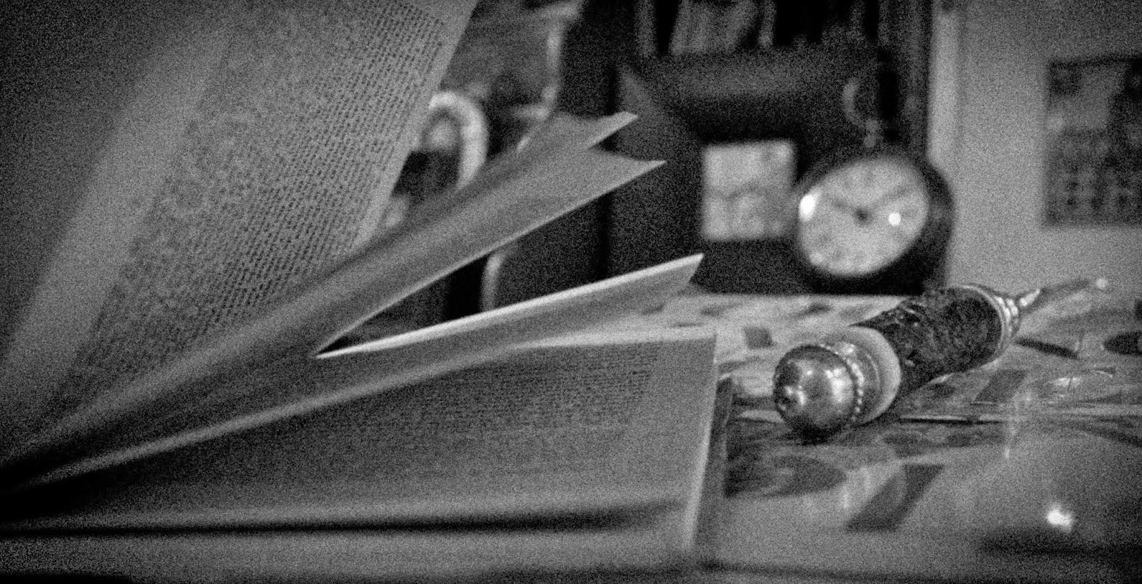 |
| The Crime Scene - While shooting this photo, I could not stop thinking that it resembled a crime scene under investigation. The book looks as if it was just being read, and in the photo, the letter opener resembles a magnifying glass. In order to make this photo seem more crime scene like, I cropped it to focus on the two components that were most important: the book and the letter opener. I then changed it to black and white. To make it a tad darker and spookier, I added a black vignette around the photo and made the pixels more grainy. The editing techniques I used in this photo had an important role in portraying the message I wanted to convey. |
 |
| Looking Through My Lense - This is a picture of an old pair of binoculars on the desk in my living room. While shooting, the lighting in the room was a tad dark, making my photos appear granier. This graniness made me think of old fashioned black and white film. To begin editing, I cropped the photo so that it would follow the rule of thirds, and focus on a more abstract view of the binoculars. Then, I changed the photo to black and white and played around with the contrast, highlights, darks, and shadows until I got to a setting I liked. Finally, I added a blue-grey duo tone over the entire picture, giving that old fashioned feel. |
