Tuesday, October 29, 2013

Project 2 - Framing and Composition

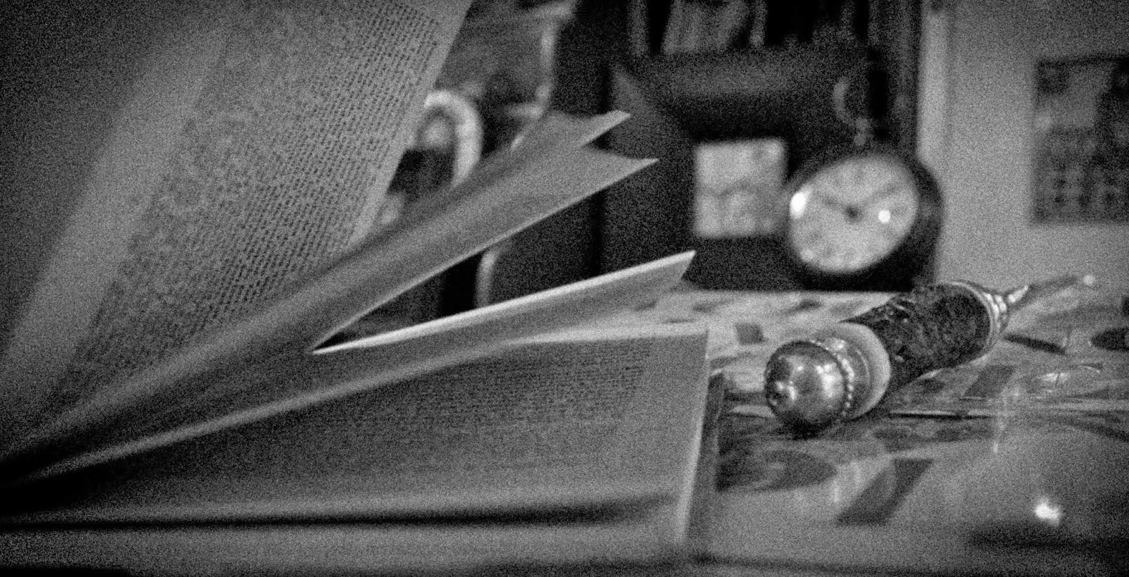
In Project 2 - Framing and Composition, we were required to use 8 different specific framing techniques that are popular amongst many photographers and artists. The first was The Rule of Thirds. The Rule of Thirds requires that you imagine a grid while taking the image. The grid is made up of 3 columns and 3 rows. A photo following the rule of thirds will place the main focus of the photo on any of the lines of the grid. The second technique was Frame Within a Frame. This framing style requires the photographer to make frames within the frame of the photo, such as windows, doors, open holes, or anything of the sort. The third technique was Filling the Frame, which is a framing technique that fills up the entire frame of the photo with the subject. The fourth technique was called Bug's Eye View. The Bug's Eye View photos are taken from below the subject, giving it a very powerful and large look. The next technique was Bird's Eye View. This type of photo is taken from above the subject, making it appear smaller, kind of like the view a bird would have flying in the sky. The sixth technique was a Close Up, which is focusing very closely on one aspect of the subject you are photographing. The next technique was Diagonal Lines, which requires some sort of slanted line in the photo. This could either be a legitimate diagonal line, or a manipulation of the camera by the photographer. Finally, the last technique was Leading Lines. This is typically a strait line or path that leads the viewers eye to the very end. After learning about all of these different framing techniques, we were required to take at least 150 photos total. We took these photos over two walking field trips, and I also took some on my own time. After taking the photos, and editing our favorites, we made a contact sheet with a minimum of 36 shots from the project. These 8 images are my 8 favorite and edited photos from the project.

Filling The Frame

Bird's Eye View
Frame Within a Frame
Bug's Eye View

Rule of Thirds
Leading Lines
Diagonal Lines

Close Up


Thursday, October 3, 2013

Project 1 - 30 x 2

Final Five Photos
For Project 1, I was supposed to choose two subjects and take at least 30 pictures of each subject. While shooting I began to play around with my camera, and was tried to discover what things I liked and didn't like. I was required to use a variety of different angles, apertures, and scene modes. Afterward I played around with editing techniques in Lightroom, a photo editing program. The two subjects I chose were my friend, Sam Flecker, and an old desk full of nick-nacks in my living room.

A Hard Day's Work - This was my absolute favorite photo out of the final five that I chose. This picture was of Sam Flecker's hands. While in Lightroom, I cropped the photo so that his two thumbs would be the main focus. After cropping, I changed the image to black and white. Following that change, I played around with the exposure and contrast, making his hands appear grungy and dirty. I then made his fingerprints and the pores on his skin clearer. This clarity also added a grungier and dirtier effect. Finally, I used the duo tone setting in Lightroom to make the image a lighter grey. Overall, my editing was aiming at making the hands looked used and tired, hence the title "A Hard Day's Work."
Radiant Smile - This is a picture of my friend, Sam Flecker. I chose this photo because it embodied Sam's lively and wonderful personality. The photo seemed to radiate a happiness, which made it a joy to shoot and edit. Although this photo already seemed wonderful to me, I added a few, minor, changes. To begin, I cropped the photo, making it follow the rule of thirds as much as I could. Then, I clarified the edges of Sam's silhouette, making him appear to come forward in the photo. Afterwards, I made the background a tad blurrier, to enhance the depth of field in the photo. To top off the photo, I played around with the contrast and brightness to make the colors in the photo pop. Overall, I really enjoyed this photo.

The Key To My Thoughts - This photo was taken on an interesting desk in my living room, full of nick nacks and interesting items my family has accumulated over the years. I chose this photo because I felt it had a mysterious feel to it. I thought the journal was symbolic of my thoughts, that only I can see, and the key resting in the notebook embodied the access to those thoughts. In order to convey this idea, I thought the photo needed a warm and intriguing lighting. I first began by cropping the photo, making the top of the journal follow the rule of thirds on the horizon line. I then played with the contrast, brightness, highlights, and shadows, making sure that the details were visible and that the photo was somewhat dark. Finally I made the top left corner brighter using the gradient tool in Lightroom. This allowed me to make it appear as if there was a lamp, or light in the corner of the photo, and that the light was shining upon the journal.

The Crime Scene - While shooting this photo, I could not stop thinking that it resembled a crime scene under investigation. The book looks as if it was just being read, and in the photo, the letter opener resembles a magnifying glass. In order to make this photo seem more crime scene like, I cropped it to focus on the two components that were most important: the book and the letter opener. I then changed it to black and white. To make it a tad darker and spookier, I added a black vignette around the photo and made the pixels more grainy. The editing techniques I used in this photo had an important role in portraying the message I wanted to convey.

Looking Through My Lense - This is a picture of an old pair of binoculars on the desk in my living room.  While shooting, the lighting in the room was a tad dark, making my photos appear granier. This graniness made me think of old fashioned black and white film. To begin editing, I cropped the photo so that it would follow the rule of thirds, and focus on a more abstract view of the binoculars. Then, I changed the photo to black and white and played around with the contrast, highlights, darks, and shadows until I got to a setting I liked. Finally, I added a blue-grey duo tone over the entire picture, giving that old fashioned feel.