Monday, June 9, 2014
Final Portfolio
An accumulation of my work in this class is shown in my final portfolio. Over this semester I feel like I became much more artistic. I really enjoyed all of the project we did, especially the project involving surrealism. After being in this class, I feel like I have the ability to create very visually interesting photos. I now know what kind of photos are interesting to a viewer, and how to maximize the artistic appeal of my photos. The skills I gained in this class will carry over to when I take photos in the future.
Tuesday, May 27, 2014
Tuesday, May 13, 2014
Reader's Digest Magazine
 |
| Page 1 (Cover) - Photo by Gabby |
 |
| Page 2 - Page by Gabby |
 |
| Page 4 - Page by Gabby |
 |
| Page 7 - Page by Gabby, Photo by Toni |
 |
| Page 8 - Page by Gabby, Photo by Toni |
 |
| Page 9 - Page by Gabby |
Tuesday, April 15, 2014
Project 9 - Fine Art and Commercial Portraits
Fine Art Photos
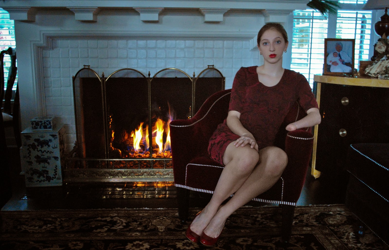 |
| Fine Art 1 - This is one of my fine art portraits that I took of my friend, Sydney. In this photo, I turned off all of the lights in the room, so that the firelight would radiate from the back of the image. The natural light from the windows illuminated by model, while casting an interesting blue hue over the whole image. This hue contrasted with the reds and yellows from the fire, making the image more dynamic. |
 |
| Fine Art 2 - This is an image I took of my friend, Emily. For this image, I placed my model in front of a black, velvet sheet that was pinned on the wall. I then turned off all of the lights in the room, only allowing a small amount of natural light through the window. Afterward, I placed a desk lamp behind my model's body. By placing the light behind my model, it illuminated the image from the back, creating an almost halo effect around her head. I enjoyed this photo because it brought out many of the beautiful features of my model. |
 |
| Fine Art 3 - This is another photo I took of my friend, Emily. In this image, I placed her in front of a black, velvet sheet that was pinned on the wall. I turned off all of the lights in the room and only allowed a bit of natural light through the window. However in this image, instead of placing the light behind her, I placed it on one side so that only half of her face would be illuminated. This created many interesting shadows, that brought out her bone structure. To edit this photo, I then changed it to black and white and increased some of the contrast to further enhance her bone structure. |
Commercial Portraits
 |
| Commercial Portrait Magazine Cover - This is a photo I took of my friends, Emily and Sara. The setting for this image was Sara's room, which I found to be a perfect backdrop for a Seventeen Magazine type shoot. To shoot this image, I had very bright light and used my flash to bring out the vibrant colors of the image. In Photoshop, I later enhanced the colors and made the text of the same color scheme. This gave the image a very cohesive and bubbly feel. |
Monday, April 14, 2014
Project 9 - Fine Art and Commercial Portraits - Contact Sheet

In my first fine art shoot, I photographed my friend, Sydney. For these photos, I like the darker lighting, because it brings out the natural light of the fireplace. It gives the photo a very sophisticated feel. Later on, I am hoping to edit these photos to potentially make the fire light radiate from the center of the picture. My second shoot was my commercial portrait shoot. Here, I photographed my friends, Emily and Sara. In this shoot, I was attempting to recreate a kind of Seventeen Magazine Shoot. In these photos, I liked the bright colors and the backdrop of the shoot. While shooting, I tried to keep the lighting very bright and have very clear and sharp images. For my last fine art shoot, I mostly shot my friend, Emily. In this shoot, I used a desk lamp to illuminate different parts of my model and to create shadows. The two photos I am mostly interested in editing are the two with more edits. In these photos, I like the dramatic shadows and different lighting. By changing them to black and white, they brought out the shadows more and gave the photo a more cohesive feel.
Tuesday, April 1, 2014
Project 9 - Commercial and Fine Art Portraits by Other Photographers
Fine Art Portraits
Fine Art Photography encompases many different aspects in the photo. In the shooting process, the photo is set up in a way with thoughtful lighting and composition. While editing, the photographer makes strategic enhancements in order to fit the mood of the photo. Overall, this type of photo has a more creative and abstract feeling.
 |
| Photo by Kyle Thompson |
 |
| Photo by Olivia Bolles |
Commercial Portraits
Commercial Portraits focus on a more cohesive feeling. Every aspect of the photo is strategic in order to portray a particular feeling or product. In this type of photography, editing techniques are used to enhance the photo and make it more appealing to the viewer.
 |
| Cover by Andrew Eccles |
 |
| Cover by Unknown Artist |
Tuesday, March 18, 2014
Project 8 - Multiple Image Techniques
For Project 8 - Multiple Image Techniques, we were required to take images and use different photo editing processes in Photoshop. The first was a photo using a multiple exposure technique to create movement. For this image, we had to take images of a single subject and either move around the subject, or have the subject move with us staying still. Later, we edited these photos in Photoshop, tinkering with opacity and different screen layers. The second image we had to take was a panorama. For this, we had to shoot multiple photos moving side to side or up and down. The photos were supposed to overlap by about 40% so that we could stitch them together in Photoshop and create one, large image. These images are able to capture much more information than a typical singular picture. Finally, the third photo we had to take was and HDR photo. For this image, we had to take multiple images of the same subject. To make the image HDR, we had to take one photo at the right exposure, two that were underexposed and two that were overexposed. To mess with the exposure, I changed the shutter speed while maintaining the same aperture and ISO. After, I stitched the images together using Photoshop. This gives the image a very Sci-Fi appearance, bringing out little details in the photo.

 |
| Multiple Exposures |
 |
| Panorama - Stitched together in Photoshop. |
Monday, March 3, 2014
Project 7 - Alternative Processes Through Digital Means
For Project 7 - Alternative Processes Through Digital Means, we were required to create a cyanotype and daguerreotype using our own images on Photoshop. A cyanotype is an old film process used to produce bluish prints. Here, photographers would paint an emulsion of Ammonium Iron Citrate and Potassium Ferricyanide onto their images to create an image that looked like a watercolor painting or blue print. A Daguerreotype is a photo taken using a Daguerreotype camera. This was one of the first photographic processes ever created. It is well known for the images appearing on grungy metal plates with interesting textures. They are iconic for their metallicity and old world look.
 |
| Cyanotype Original |
 |
| Cyanotype |
 |
| Daguerreotype Original |
 |
| Daguerreotype |
Tuesday, February 18, 2014


Thursday, February 6, 2014
Project 6 - Surrealism and Photomontage
Surrealism is a form of photography used to contradict many typical forms of imagery. Using various editing techniques, surrealist photographers have been able to create very illogical and dreamlike images. From strange creatures, to eerie images, they have done it all. The elements of surrealism involve layering many different photos along with enhancing textures and colors. The entire composition is aiming for an element of surprise and out of this worldliness. Two extremely famous surrealist artists are Dali and Magritte. Through their artwork, they have revolutionized the surrealist form and created an art technique that is not conventional, but very beautiful.
 |
| The Son of Man - Rene Magritte |
 |
| The Persistence of Memory - Salvador Dali |
Tuesday, February 4, 2014
Tuesday, January 21, 2014

Thursday, January 9, 2014
Project 4 - Balance and Contrast
In Project 4 - Balance and Contrast, we were required to use various techniques of shooting and editing. We first learned about the different kinds of balance and contrast, such as symmetrical balance, asymmetrical balance, radial balance, contrast in scale, contrast in texture, contrast in color, and contrast in value. Afterward, we were assigned to take single photos using these techniques, edit, and post are 2-5 favorites. Later, we learned how to make kaleidoscopes using photo shop. Here, we would take a photo, crop it in an interesting manner, then edit and rotate the image to make a kaleidoscope. We would later edit and rotate the image using the different layers on photoshop. Finally, were were assigned to create two diptychs and two triptychs. Diptychs are laid out with two photos of the same or similar subjects. A triptych is the same, but with three photos. These images are my favorites from this project.
 |
| Branches Kaleidoscope |
 |
| Flower Kaleidoscope |
 |
| Light Bulb Kaleidoscope |
 |
| Sunflower Kaleidoscope |
 |
| Mural Kaleidoscope |
 |
| Symmetrical Balance |
 |
| Contrast in Texture |
 |
| Contrast in Size |
 |
| Contrast in Color |
 |
| Waterfall Triptych |
 |
| Sydney Triptych |
 |
| Sydney Diptych |
 |
| Lips Diptych |
Subscribe to:
Comments (Atom)