Fine Art Portraits
Fine Art Photography encompases many different aspects in the photo. In the shooting process, the photo is set up in a way with thoughtful lighting and composition. While editing, the photographer makes strategic enhancements in order to fit the mood of the photo. Overall, this type of photo has a more creative and abstract feeling.
 |
| Photo by Kyle Thompson |
I found the composition and lighting of this photo very intriguing. I thought it was very interesting how the photographer created the contrast in shapes with the circular background, and the more angular body pose. I also liked how the lighting is coming from the end of the tunnel, creating a leading lines effect, along with a shadowy foreground. I thought it was very effective how the photo follows one color scheme: a brownish-grey hue. This gives the photo a very eerie and dark feel, which is complementary to the composition of the photo.
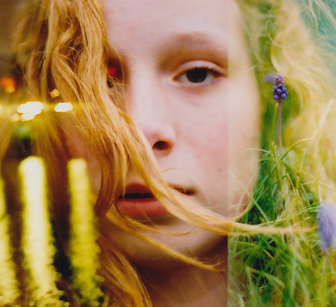 |
| Photo by Olivia Bolles |
I enjoyed the mood and composition of this photo. I like the way that Bolles created a very aetherial feeling by combining the photo of the girl and the flowers and plants. The lighting of the photo is very bright, bringing out the pale colors in the photo. I enjoyed how she combined multiple photos, and thought that the ones she chose had a very cohesive feel. The way she edited these photos was very effective, because the subject of each photo fit very well with the next.
Commercial Portraits
Commercial Portraits focus on a more cohesive feeling. Every aspect of the photo is strategic in order to portray a particular feeling or product. In this type of photography, editing techniques are used to enhance the photo and make it more appealing to the viewer.
 |
| Cover by Andrew Eccles |
I thought the approach to this photo was very creative. I enjoy how Eccles combined the image of the skater and the mountain to make this a very surreal photo. It spoke to the setting of the olympics, as well as highlighted the beauty of the sport of figure skating. I also enjoyed the way he enhanced the colors, and made the skater appear very warm. The pose of the skater is also very effective, because she looks very happy and proud, a feeling that is associated with the Olympics.
 |
| Cover by Unknown Artist |
I found this cover to be very effective through the editing done by the photographer. I liked the way he enhanced the bright color of her eyes by using more neutral tones throughout the photo. I also think that it is very effective the way he made the writing the same color as her eyes. I also found the placement of the writing on the cover very effective. Most of the writing frames her face to be the focus of the image, but the writing does not take away from the rest of the photo.